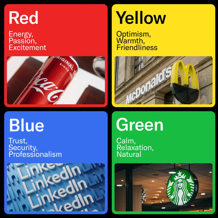
Color psychology is the study of color and its influence, that is, the impact that is made by color on people. It considers how some colors stimulate certain emotions, such as trust, excitement, or relaxation. In branding, this knowledge is useful in selecting the appropriate brand colors that fit their values and appeal to the customers emotionally.
For example:
Blue is usually associated with trust, calmness, and professionalism in various organizations and businesses.
Emotional marketing is the way to position your brand in a way that triggers certain emotions in people.
Your brand colors are not mere decoration. They are key components of the business image. They preserve history, convey meaning, and contribute to the overall aim of making the brand unique. Consumers judge products within the blink of an eye, and the color is usually the first thing that strikes them.
For instance, research indicates that up to 90% of first impressions are formed based on colors alone. This is why color selection should be a part of your branding strategy plan. Consider how your chosen color(s) will look on your website, packaging, social media, and other advertisements.
Your brand colors should:
Consistency is key. If a company uses one set of colors on the social media platform and another on the website, customers are bound to feel uncomfortable. However, when your colors are consistent across all platforms, you are a familiar, reliable brand—just as it should be.


Emotional marketing targets the heart, not the mind; color is one of the most influential emotions. The idea is to share an emotion with your audience so that they do not just recognize your brand but have an emotion in response to it.
Here are some examples of how different brand colors can be used in emotional marketing:
Each color has its own emotional connotations. When you know how your audience feels or what you wish your audience to feel—be it excitement, trust, or calm—you can use color psychology to make them feel that way every time they see your brand.
Your brand image comprises all the visual elements people can perceive: your logo, website design, packaging, etc. Color is a key part of this. It is always essential to have a strong and clear identity when it comes to visuals, and this is usually achieved by embracing the right color association.
Here are the steps you need to follow when selecting colors for your palette:
Ensure that the colors used in the combinations are harmonious. Check how they appear on both the screen and in print. Most importantly, ensure they are accessible—some combinations are not optimal for color blindness.
The most beautiful strategy is not only skin deep. It creates a structure where everything seen, especially the color, has a specific function.
Various other industries also define certain trends through color, depending on the emotions they expect from their audience. This is why some brands use specific colors across different types of products.
However, it is better to take a risk, and with risk comes the opportunity to become remarkable. For instance, if a company from the IT segment chooses pink as part of its color scheme, it can mean fresh or innovative. It is more important to ensure that it maintains the tone and theme relevant to your brand.
The role of color psychology can be described as useful but critical to establishing a powerful brand image. Colors have different impacts on feelings, actions, and recall. Brand colors are not just an appearance but a key element in your emotional marketing strategy.
Here's what to keep in mind:
This means that if you are interested in making people remember, trust, and love your brand, it all starts with the color you use. People may forget about your tagline, but they won't forget how you made them feel. And it is color that plays a significant part in such memories.
