Your brand materials depend on specific letter styles to shape how people perceive and experience your business. The effect of typography branding becomes significantly apparent at this point.
Selecting an attractive font barely scratches the surface of what typography involves. Your brand should select a typographic style that accurately represents its voice, core values, and messaging operations. Good typography enables a professional appearance while maintaining consistency in your brand appearance and establishing trustworthy relationships with your audience.
Your brand personality and tone become visible through specific typefaces, which form the core of typography branding. Your font selection, from your business logos to your website text, communicates the type of business you represent.
Your brand expresses itself through contemporary or traditional styles. Friendly or serious? Bold or soft? Before readers start reading any text, the chosen fonts transmit essential signals to reveal key details about your brand. The role of typography goes beyond basic design considerations because it sets crucial aspects for the audience to perceive. Your brand design's visual and customer experience components start with typography branding.
Proper typography branding produces businesses that stand out to audiences while ensuring their message remains straightforward.
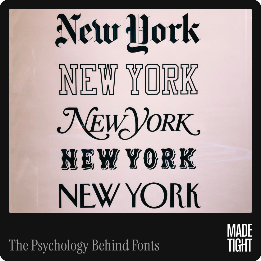
Similar to colors, fonts can stimulate specific emotional reactions. Font psychology describes this phenomenon. Different letter shapes result in various responses from people. Sharp-edged fonts communicate strength through their design, while round, soft fonts establish welcoming feelings in viewers.
Various common font styles create different psychological effects on people, which can be observed below:
Technical and logical appeal characterizes monospaced fonts commonly appearing in coding or digital branding materials.
Your font selection matches your brand personality by analyzing font psychology. Your playful tone will mislead your audience when paired with a formal font selection. When you select the correct typeface, your brand voice acquires power and deeper significance.
Well-thought fonts that are easy to read prove that the author or designer pays attention to the user’s needs. This is where the proper use of typography comes into play.
If you use small and fancy fonts that are difficult to read, your viewers will be forced to go elsewhere or ignore your message. On the other hand, good typography encourages the readers to continue reading throughout the content. It guides the reader’s attention across your writing, making your communication process smooth and pleasant.
In turn, effective typography within well-designed brands is useful in the following ways:
Every time you design your website, business card, brochure, or even the packaging of your product, there is something that can attract customers or repel them, and this is the font you choose.
Your brand identity should look familiar to your customers regardless of their use. That is why a successful visual branding system must be so powerful. And type is not a small part of that system.
The fonts to select must be consistent throughout the brand—from the logo to social media posts, your website, and printed materials. This is important because people will easily remember your brand if it is consistent in how it appears in the media. It also enables employees to trust and be professional and creates work commitment.
If your font varies from segment to segment, your image may appear sloppy or untrustworthy. But when it comes to fonts, your business looks solid and unambiguous when they remain unchanged.

Brand consistency is a state in which all branding elements are cohesive and uniform. Typography helps you achieve this.
Here’s how:
When your fonts are consistent, your target consumers become familiar with your brand, which may help them decide to purchase. In the long run, this fosters better brand familiarity—people will recall your brand more frequently and work with it again.
In fact, research has found that integrated branding could increase revenue by up to 23%. That includes making sure the typography is strong.
Choosing the appropriate fonts for your brand is not difficult at all, but it does call for a certain amount of consideration. However, here are some tips that can assist you in making a better choice:
Start with your brand personality
Are you fun, serious, or simply minimalist? Do you want to make a statement? Make sure your font supports that sentiment. Let your font evoke that sentiment.
Think about your audience
Who are you speaking to? Younger people might feel more comfortable with modern fonts, while older customers might do better with traditional fonts.
Test for readability
Ensure that your typeface is easily readable both on computer screens and on paper. Try different sizes and weights.
Limit your choices
Limit your font number to 2-3: You can use one font for headlines, one for body text, and a third for special occasions. Too many fonts can be very confusing in a design because they do not look professional and proper.
Use contrast for clarity
Never use two big fonts, but try to combine bold and light fonts or big and small fonts to control the eyes' flow.
All of these small decisions contribute to the establishment of clear, powerful, and memorable typography branding.
Now, let’s consider real-life examples of how some of the world’s biggest brands use typography to influence peoples’ thinking:
All of these options align with the company’s brand tone and effectively create rapport with viewers.
Typography can be considered a minor issue, but in fact, it significantly affects how our brains perceive certain visual designs. Whether talking about your corporate logo or the text on your firm’s website, fonts contribute to the message you want to convey and to the persona you wish to build.
Thus, by paying attention to typography branding, knowing the psychology of fonts, and maintaining the unity of the style, you create a powerful image of yourself. Good typographical practices make your content more readable and your brand more credible.
Well, next time you decide to do your branding, do not just choose any font. Choose one perfect for representing your brand—eloquently, cohesively, and assertively.


.svg)
.svg)